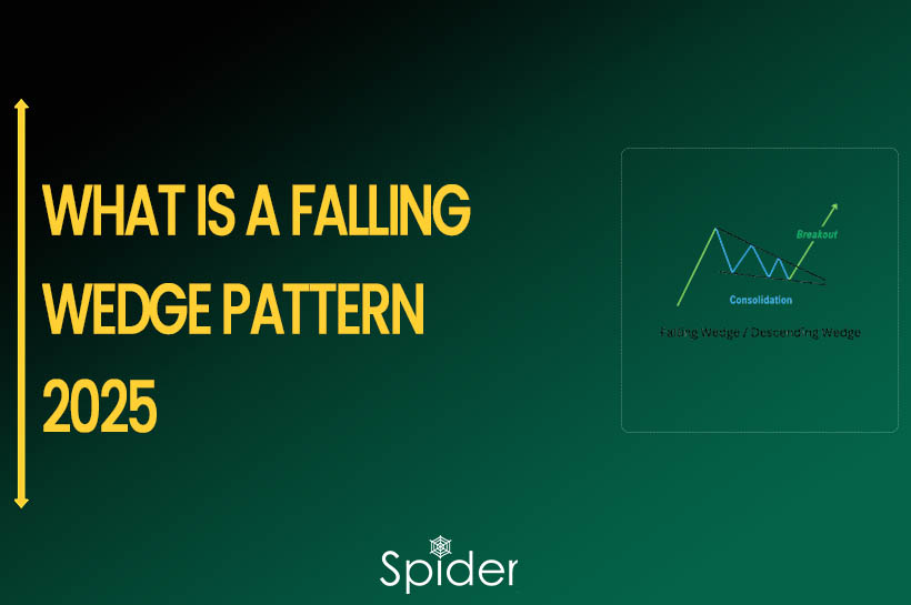
This information can be useful to investors who are looking to make informed decisions that will help them trade in the market.
What is Stock Chart?

Stock Charts are essential tools for traders and investors to Analyze and Visualize Price Movements over time. There are various types of Stock Charts available, and understanding the differences between them can help traders make informed decisions.
Here are some of the most commonly used types of Stock Charts:
1. Line Chart
Line Charts are a fundamental tool in Technical Analysis used by traders to visualize the Historical Price movements of a stock over a specified period.
This type of chart displays a Single Line that connects the Closing Prices of a Stock at each specified Time Interval, providing a quick overview of the stock’s historical trajectory.
Trend Lines are often used to connect the Peaks and Valleys in the Chart to identify Potential Price Inflection Points and Breakouts.
While Line Charts are popular for presentations and reports, they may be too simple for active day traders who require more detailed information to make informed trading decisions.
An example of a Line Chart in Nifty created using Spider Software is shown below.

2. Bar (OHLC) Chart
Bar charts, also known as OHLC Charts, are a Western version of Japanese candlesticks.
They use Vertical Lines to represent the Highest and Lowest Prices for a specified period, with a short horizontal line on the left for the opening price and another on the right for the closing price.
The color of the bar indicates Net Gain (Green) or Loss (Red), but this is optional.
Bar Charts lack the color-filled body of Candlestick Charts, making them simpler to follow.
They also better visualize the Price Range, whereas Candlestick Charts can be emotionally distracting.
Below shown is an example of a Bar Chart applied in Nifty using Spider Software.

3. Candlestick Chart/ Japanese Chart
Candlestick Charts originated in 18th century Japan to track Rise Futures Prices.
They have since become the Most Popular Style of Chart used by Traders, using Opening, High, Low, and Closing Price Data to generate a Candlestick for a specified Time Interval.
The candlestick has three parts: The Body (colored Green or Red), The Upper Tail, and The Lower Tail (also known as Wicks). Green Candles represent Price Rises, while Red Candles indicate Price Drops.
Traders often look for specific Candlestick Patterns to generate Trading Signals.
An example of a Candlestick Chart / Japanese Chart in Nifty created using Spider Software is shown below.

4. Heikin-Ashi Chart
Heikin-Ashi charts are a popular form of Japanese Candlestick charting that use an average price calculation to smooth out market noise and more clearly show the trend of the market.
The name “Heikin-Ashi” means “Average Bar” in Japanese.
Instead of using Traditional Candlestick Charting, Heikin-Ashi Charts use modified candlesticks that factor in the Average Price of the prior period.
This results in a chart that more clearly shows the direction of the Trend, making it easier for traders to identify potential Entry and Exit Points.
Heikin-Ashi Charts are particularly popular among traders who use a Trend-Following Strategy.
Heikin-Ashi Charts are constructed based on averages over Two Periods.
Below shown is an example of the Heikin-Ashi Chart applied in FinNifty using Spider Software.

Conclusion
In conclusion, there are several different types of Stock Charts that traders use to Visualize Market Data and make Trading Decisions.
Line Charts provide a simple bird’s eye view of historical price action, while Bar Charts and Candlestick Charts offer more detailed visualizations of price ranges and trends.
Heikin-Ashi Charts are a modified form of Japanese Candlestick Charting that use an average price calculation to smooth out market noise and more clearly show the direction of the trend.
Each Type of Chart has its own advantages and disadvantages, and traders often choose the one that best fits their trading style and strategy.
Disclaimer: The information provided in this Blog is for educational purposes only and should not be construed as financial advice. Trading in the stock market involves a significant level of risk and can result in both profits and losses. Spider Software & Team does not guarantee any specific outcome or profit from the use of the information provided in this Blog. It is the sole responsibility of the viewer to evaluate their own financial situation and to make their own decisions regarding any investments or trading strategies based on their individual financial goals, risk tolerance, and investment objectives. Spider Software & Team shall not be liable for any loss or damage, including without limitation any indirect, special, incidental or consequential loss or damage, arising from or in connection with the use of this blog or any information contained herein. ![]()